Question:
I make all the figures for my grant applications in PowerPoint, but I’ve heard that some applicants for the big grants hire graphic designers and science illustrators. Are good visuals becoming make-or-break in research grants? Even if I’m not proposing multi-million-dollar projects?
– Anonymous, Rehabilitation Sciences
Dr. Editor’s response:
I don’t think you need to hire an illustrator or graphic designer if you’re applying for a conventional CIHR Project Grant. But I do think that some free or low-cost resources might be worth drawing on for your next application.
Over the past few weeks, I’ve been interviewing academics in Canada who have served on SSHRC and CIHR peer review committees, to learn more about their experience of reviewing and to collect their advice for applicants. One thing these former reviewers keep telling me: “we can tell when an application has been phoned in.”
Researchers who read and write in to this column aren’t the most likely candidates for phoning in a grant – in my experience you tend to be the proactive, plan-loving type. But despite these good plans, when it comes to visually conveying your prospective projects, many of you lack the graphic design skills necessary to render your visuals in a sophisticated and compelling way. Research tells us that grant peer review panels tend to focus on “eliminating applications that are considered weak” (van den Besselaar & Mom, 2021), and if your figures are letting you down, you risk looking like one of these weak proposals.
In his provocative “Flipping the grant application review process,” Ivo Dinov argues that too much of a focus on “grantsmanship artistry … drains energy, consumes resources, favours process over content, and demands elaborate maneuvers intended to impact the politics and perception of the proposed work” (2020). With Dr. Dinov’s critiques of the burden of grant applications resounding in my ears, this month’s column focuses on low-effort, high-reward quick fixes that can contribute to a shiny, polished grant proposal. Next month we’ll focus on timelines specifically; this month, I want to hone in on your images. I’ve written about colour previously, but this time around, I want to focus on shortcuts that can help your grant look great, even if you don’t have Photoshop.
1. Great graphics aren’t required
If you look through a number of successful grant applications in Open Grants, you’ll notice that grants with less-than-stellar graphics get funded all the time. That’s a good thing – it means the reviewers have seen past an awkward visual and looked directly at the scientific value of the proposed work.
Consider, for instance, these two representations of rodents, below. The mouse on the left is from a successful NIH grant application, while the rat on the right is from an article published in European Urology:
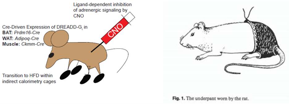
So, as a starting point: when your work is great, your figures don’t need to be visual feasts. They need to be clear and comprehensible, but your mice don’t need to have accurately sized feet.
If, however, you’re concerned that your graphics may diminish the credibility of your application – if they might distract the reader, or if you’re claiming knowledge translation skills that your graphics undermine – you might find that selecting the right tools can make it easy for you to quickly create a compelling image.
2. Good graphics are ones that address the evaluation criteria
If I had edited the grant proposal on the left, I might have revised the image to something like this:
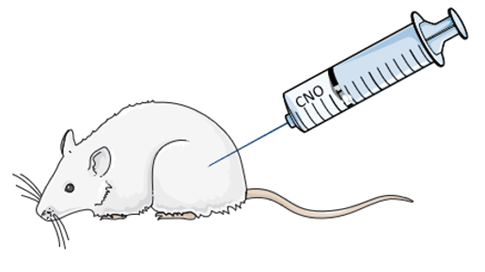
Creating this image only took about four minutes, using the free medical clipart from Servier Medical Art and PowerPoint. This new image doesn’t improve the quality of the science in the proposal, but it might suggest to reviewers something about either the resources available to the applicant or the care they have put into developing their proposal – attesting to feasibility and credibility, respectively. Given that CIHR Project reviewers are looking for applicants who have “access to the appropriate infrastructure, facilities, support personnel, equipment, and/or supplies” (as per their evaluation criteria), it seems to me that sophisticated, polished applications imply high-quality research environments and supports.
While Servier Medical Art is a useful, free resource, the scope of its available images is limited. If it doesn’t have what you need, there are other good options. Here’s another great image from a successful grant application shared in the Open Grants database:
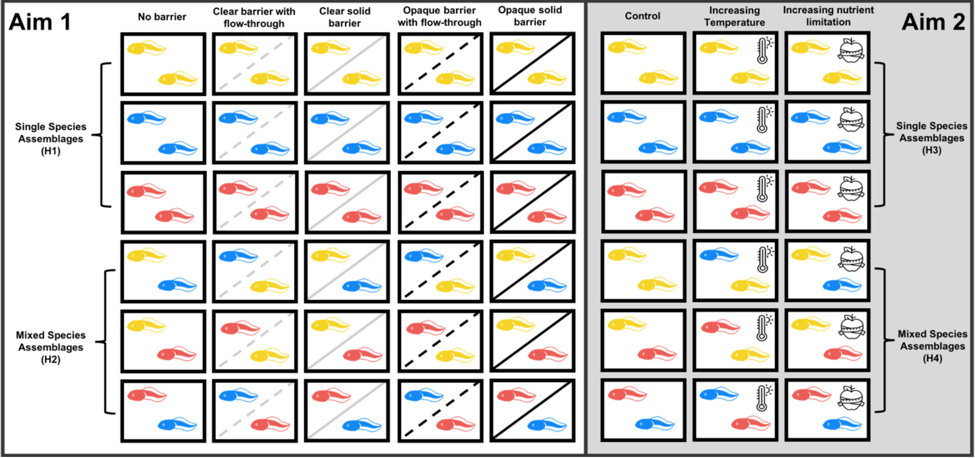
Even without a figure title or caption, it’s pretty clear from this image how the applicant has set up their experiment, aligning their approach with their two aims. That figure was created for the U.S.-based NSF, but if the researcher had been applying to NSERC, then I can imagine that the figure would be a useful contribution to the clarity of both the objectives and methodology (as per NSERC’s selection criteria).
And that wee tadpole? He’s available in any colour from The Noun Project – just search for “tadpole.” I pay The Noun Project around $45 per year so that I can download any of their icons and use them without attribution. And once I started using them for grant applications, I soon discovered that it was useful to have access to a broad set of simple images when developing teaching resources and conference presentation slide decks.
So, do you need to hire a graphic designer or scientific illustrator? Those folks have excellent skills that may help you to see your own work in new ways – but until you receive the grant and have the budget for their time, I think you can make do with some basic clipart-style icons and PowerPoint.